In November of 2023, I participated in Tildes’ annual Backlog Burner event. It’s a community-run event where participants play through unfinished titles in their gaming libraries. As somebody with a backlog that never seems to shrink, this seemed like the perfect opportunity to finally make some progress in mine.
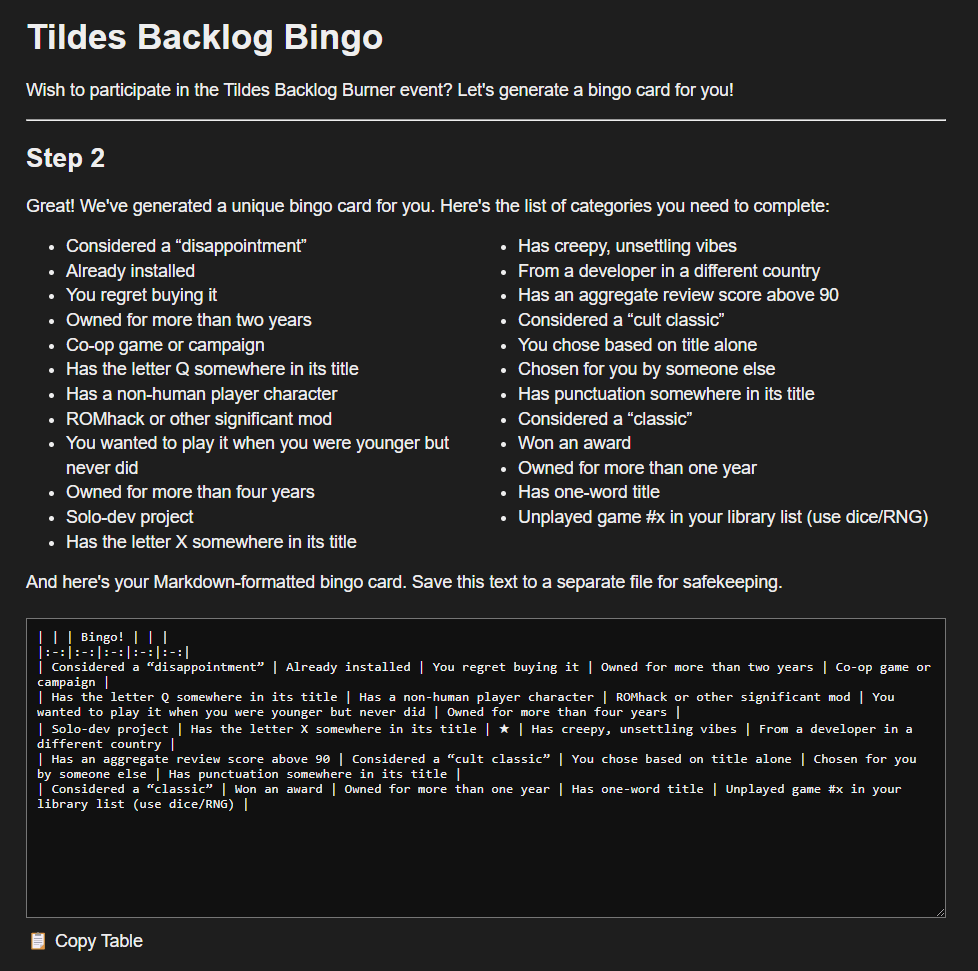
One of the ideas proposed for this year’s event was to use personalized bingo cards populated from a large selection of categories. A category might, for example, include playing a game with an animal protagonist, or from a now-defunct studio. These categories would be randomly selected, and participants would then play games from their backlog to fulfill the category requirements. The bingo cards themselves would be shared as Markdown tables when posting progress updates.
Though a fun idea, there wasn’t a simple way to generate these tables for each user. To help streamline the process, I offered to build a little web app to automate things. It first allowed the user to uncheck any categories they found impossible to complete, then selected randomly from the remainder and generated a table with the result. The user would save this table, and update it as the event went on.

The Backlog Burner event was indeed a success, and everyone had a lot of fun playing games and sharing our thoughts. The bingo card system also proved to be a crowd favourite. There was no required way of playing, so some chose to submit one game per category, while others played in a “golf” style mode, aiming to complete their card with as few game submissions as possible.
Though everyone was able to understand the system, the biggest source of friction was definitely in editing the Markdown. The generator was designed to run only once, producing a table for you to edit. This saved a lot of time versus building it yourself, but Markdown tables are still difficult to edit by inexperienced users, and especially when on mobile. For the next event, I knew I wanted to simplify this process even more.
New Ideas
So in February when I had some free time, I reached out to the event organizer and pitched some ideas. I wanted the bingo card to live on the site with a simple editor, such that the Markdown was generated automatically on each change. I also wanted to introduce some additional features, while still allowing the freedom that users discovered while using the first version. The organizer was excited by these ideas, so I got to work.
Like the original version, I began by writing in vanilla JavaScript. For smaller projects I prefer to avoid adding too much complexity from external tooling or build pipelines. Working from my original codebase, I started by separating the logic out into different modules: game rules, categories, and the bingo sheet itself. For the UI, I still worked from a simple HTML file but used <template> blocks to swap between the different “pages” in the app.

Eventually I began to find the complexity ballooning as I added new features. State management was getting messy, and all the DOM manipulation required a lot of additional code to keep elements in sync with their values in memory. These are the kinds of problems best solved with data bindings and a reactive framework.
New Tools
So it was time to introduce new tools. I considered a few options, but ultimately decided to use Vue 3. Vue offers quick onboarding and great tooling, and felt like the right level of complexity for the job. I was unfamiliar with the framework though, and did need to learn how to properly use it.
Thankfully I already owned the course Vue - The Complete Guide, which came highly recommended. At a whopping 32 hours long(!) I ended up running through most of the course at 2x speed. I’m not normally one for video tutorials, but I did find the comprehensive overview helped solidify many of the important concepts for me.
The majority of the tutorial used the Options API, which was the only approach available when it was recorded. Today the Composition API seems more popular, so that is what I ended up going with. For the most part the transition was just a matter of looking up the new syntax. There’s a few gotchas, and it requires a deeper understanding of Vue’s reactivity system, but on the whole using <script setup> with Single-File Components is a very nice developer experience.
So returning to my project, I decided it would be better to start fresh than try to layer Vue on top of my existing codebase. I used Vite for a local web server, an upgrade from the Python 3 server I was running before. ESLint was added to keep things neat and consistent. I also configured GitHub Actions to automatically build the project when I pushed commits.
For plugins I opted to implement Vue Router for navigation, but decided against Vuex/Pinia for state management. Stores and composables in Vue 3 seem good enough for this purpose, and I still wanted to minimize dependencies where I could.
New Start
This time I started by laying down a more solid foundation. Before adding any app logic, I introduced data stores, interfaces for interacting with them, and routing logic. Being my third version of the project, I had a better understanding of the scope and structure going in.
As before, I began by implementing categories.
Category Lists
In the first version, I had simply hardcoded the categories into the app. Of course I wanted to go further this time.
I defined a JSON format for loading categories, called Category Lists. I added methods for loading these from a file or URL. Vue components made it very easy to separate out the rendering code while sharing parsing logic. Prebuilt categories for the Backlog Burner were also included, so they can be easily selected from the menu.
Because JSON is very flexible, I was able to introduce additional metadata to each category. For example during testing of the original version, I found that similar categories would often end up in a generated bingo card together. I decided to create a grouping system to bias the generator to discourage this from happening, keeping each card feeling more unique. If desired, this behaviour can be turned off in the settings.
Game Rules
Next, I created a game rules interface for customizing how the game is played. I wanted to keep the app simple to use and accessible, while still allowing for the kinds of customization that benefits power users. I broke it down into two sections: Game Rules and Game Modes.
Game Rules are individual settings that allow you to customize the bingo card generator and interface. You can edit your grid size, win condition, the behaviour of the star tile, and more.
Game Modes then are predefined loadouts for those rules, each defining a specific playstyle or approach. For example, the Golf game mode - as inspired by the first Backlog Burner event - allows entries to count for any number of categories, but requires a complete blackout to win (not just a single row or column).
Selecting the Custom game mode allows each rule to be individually edited, so you can completely customize your experience.
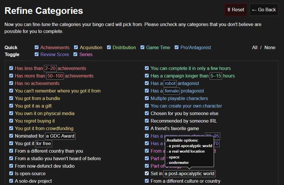
Refine Categories
As before, it’s possible to filter out any categories that are impossible for the user to complete. I knew this page would likely end up being a wall of text though, so I tried adding some features to make it more accessible.
Selection toggles were added for bulk entries, as well as individual groups. Color coding was also introduced to make groups easier to recognize at a glance. Colors are generated dynamically to maintain an equal distribution in hue, while their lightness and saturation are determined by the color scheme.

Dynamic Categories
Later in the process I added dynamic categories as a way of including more variety within a single list. This includes an on-demand random number generator and a phrase selector. These are parsed from the JSON category name using a special syntax and constructed into Vue components. I’ll share some details there because I felt it was an interesting problem to solve.
My first approach was to use a regular expression to convert these values into elements as strings, then pass them to v-html (which is essentially Element.innerHTML). This worked fine, but it felt problematic to accept arbitrary user input (as a JSON file) and extract that data directly into HTML. Even when following OWASP recommendations to sanitize against XSS attacks, it made me nervous. This approach also had the downside that it couldn’t work with Vue components as they are not executed as strings.
After thinking about the problem some more (and bouncing ideas off of ChatGPT), I came up with a system for iterating through the string manually to build new elements. It’s still based on regex, but instead of returning a mutated string we’re assembling an array of elements with metadata. Then in the template, we loop through that array to create real elements. No more need for v-html!
Tooltips
At first I used the title attribute as a tooltip to show possible values for these dynamic categories, but of course this is not very mobile-friendly. I considered some common options like Tippy.js which I’ve used in the past, but it was a little larger than I wanted to include in this project.
Eventually I found Floating UI, which is a lower-level library but comes in at a smaller size. It’s roughly a polyfill for the upcoming Anchor Positioning CSS spec, so I may be able to drop it completely when that becomes generally available (though at the time of writing, it sits at an impressive 0% on CanIUse).
Floating UI doesn’t include simple tooltip code by default, but it does offer all the features necessary to write your own. So by following their tutorial and writing a little CSS, I was able to get Floating UI integrated into a Vue component and rigged up for tooltips. Now my dynamic categories were mouse, keyboard, and mobile friendly.
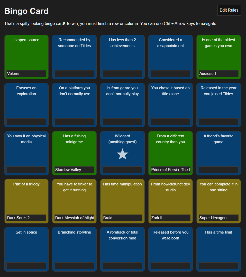
Bingo Card
Finally it was time for the bingo page itself. Thankfully, due to all the prep work this turned out to be easier than expected. Vue’s data bindings made it easy to model the actual form inputs, and the various abstractions I’d written meant the data didn’t get too tangled.
After implementing the basic UI and saving/loading, I wanted to add some logic. More than just storing your bingo card, the page should communicate things like invalid states or if you’ve won the bingo.
For win detection, I started by creating a list of possible win states. These are determined by the current win condition and grid size. For example if the win condition is “Row, column, diagonal” with a standard 5x5 grid, that will create 12 arrays: 5 rows, 5 columns, 2 diagonals. Each is mapped to the category IDs that make up that line, and if all are filled in then a win is detected. The function also returns the winning tiles so they can be styled differently.
Duplicate entries are also detected. In standard mode, any tiles with the same value will be grayed out, preventing a win until they are resolved. This behaviour can be disabled with a custom game rule, or by playing in the Golf game mode.

Accessibility
Though I’m not an accessibility expert, I try to follow the best practices and meet WCAG recommendations. Tap targets have been enlarged for mobile, and hotkeys for navigating tiles were added to desktop. I implemented ARIA roles on the tooltips, and remained mindful of semantic elements.
The app supports both light and dark mode, with hand-picked colors for each. I checked each page against common forms of color blindness, and verified the contrast levels meet recommendations.
Adding Delight
More than just functional, I wanted the app to feel delightful. I wanted players to feel excitement when completing their bingo card.
When your card is first generated, each tile starts facing away from you. The tiles then begin to flip over one by one using a 3D CSS transform to reveal their category. The animation speeds up to a flurry before dramatically pausing on the final, centermost tile.
Although I think it’s a lot of fun, I knew an animation this long could annoy some users. I made sure to include a Skip button, and to also respect the prefers-reduced-motion preference for those users with a sensitivity to motion.
Of course, the win detection needed some pizzazz, too. I opted to incorporate the lovely fireworks-js for a dazzling finish.
In Closing
This started as a fun weekend endeavour, but quickly turned into a more ambitious project. It involved a lot of learning, planning, and development. I’m extremely happy with the end result though, and am beyond excited for the next Backlog Burner event in May where we’ll be showcasing this new version.
As always, the code is licensed under MIT and available on GitHub.